I’ve tried a lot of glaze mixes in my own studio and getting consistent results has always been tricky.
Some combinations just seem to behave better across different firings and clays.
I started keeping notes on the ones that came out reliably without extra fuss.
These twenty are the straightforward ones I reach for now when I want fewer surprises.
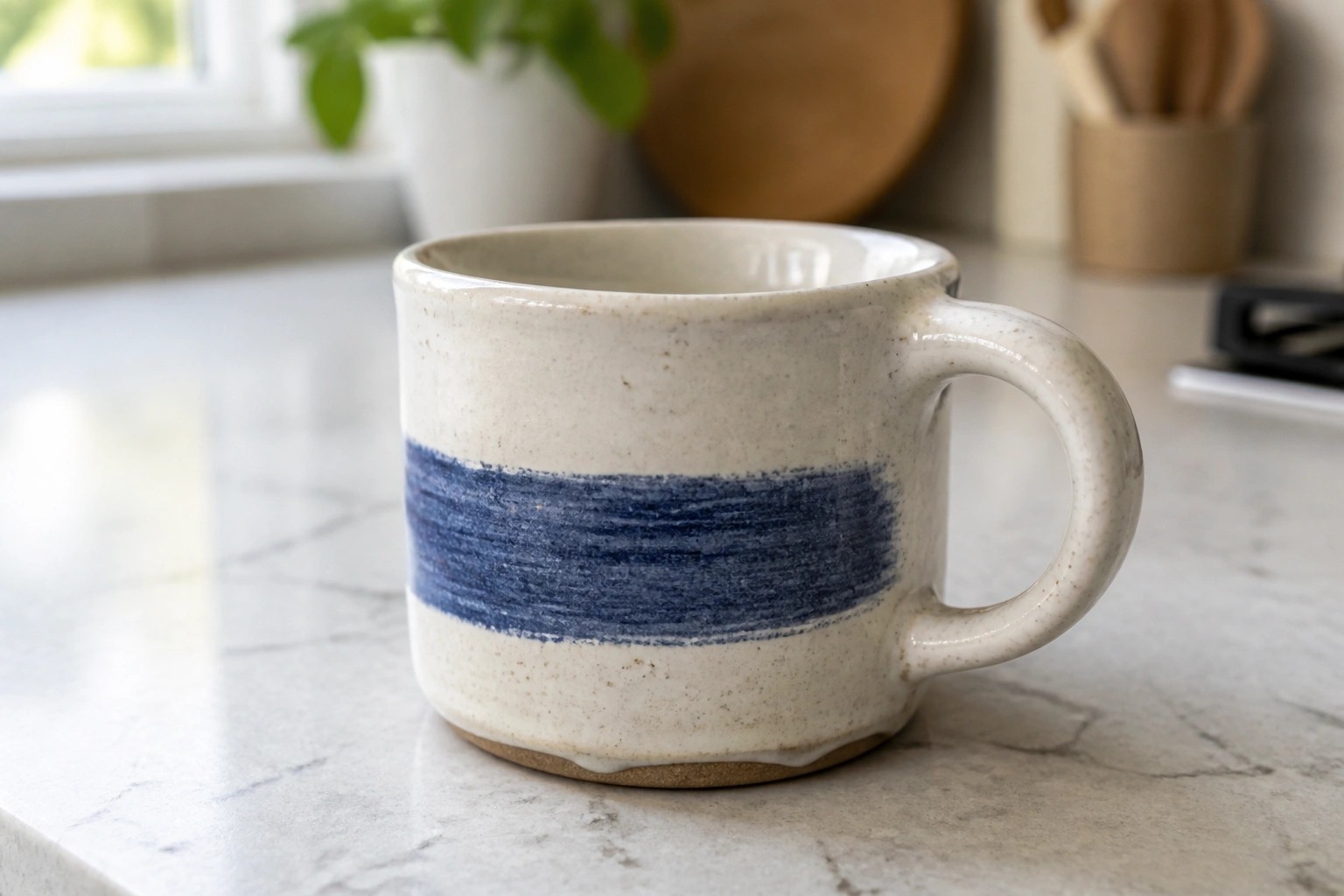
Cream Mug with a Single Blue Band
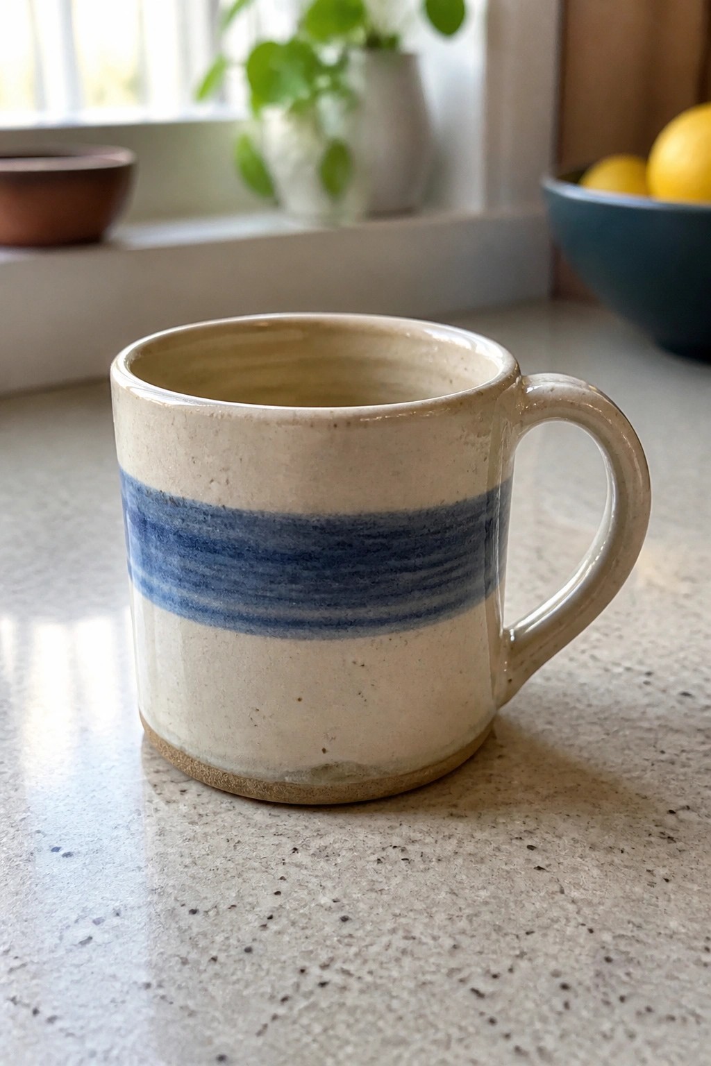
A small handmade mug covered in a light cream glaze gets a single wide blue band applied around the middle. The stripe sits evenly between the rim and base, letting the two colors meet in clean horizontal lines. This glaze combination keeps the focus on the mug’s simple cylinder shape and the contrast between the pale background and the saturated blue.
What makes this idea useful is how the band highlights the form without adding extra detail. You could repeat the same stripe on a taller mug or shorten it for a low bowl to change the scale. In a kitchen this kind of piece works well for daily coffee or tea and pairs easily with other neutral dishes. The limited palette also makes it straightforward to test how two glazes interact on different clay bodies.
Light Green Glaze Over Iron Radial Lines
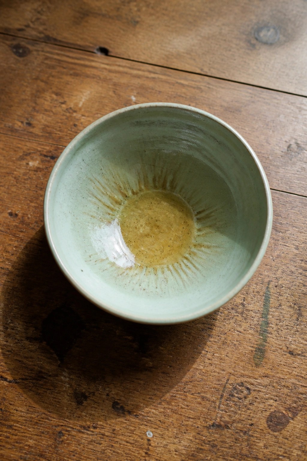
A small bowl finished in a pale green translucent glaze shows a clear sunburst pattern of iron lines radiating from the center. The glaze pools slightly in the middle, shifting to a warmer tone where it thickens. This combination lets the iron wash remain visible while the green tone softens the overall surface. The wheel-thrown shape keeps the focus on the simple glaze interaction rather than added texture or form.
The shape does a lot of the work here by directing attention to the center pattern. This kind of bowl works well for small servings or as a catch-all on a desk or shelf. The same iron lines could be spaced farther apart on a plate or tightened into tighter rays on a taller cylinder. Testing the green glaze over the iron on a few tiles first helps control how much color breaks through at different thicknesses.
Rust Rim Band on Matte Plates
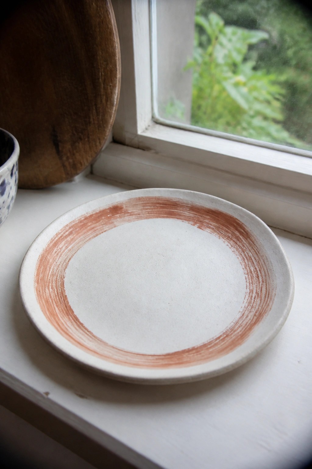
A standard round plate gets its look from a wide, brushed band of rust-colored glaze around the rim over a matte off-white base. The center stays plain so the rim detail reads clearly without competing with food or other tableware. This works as a simple kitchen plate or serving dish where the contrast between the two glazes creates interest through color rather than pattern.
What makes this idea useful is how quickly the same rim treatment can be applied to bowls or small trays for a loose matching set. The shape of the plate does most of the work, so the glaze combination stays easy to control and repeat. In a kitchen this kind of piece mixes well with plain stoneware while still showing it was made by hand. You could swap the rust wash for any iron-bearing slip or a soft gray to shift the palette without changing the basic layout.
Split Glaze Rectangular Tray
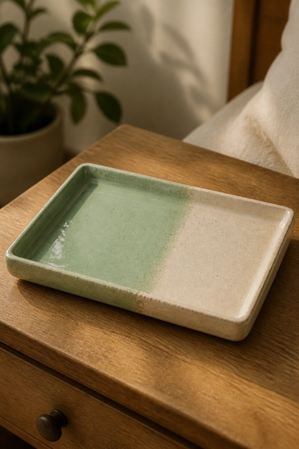
A rectangular tray with a center split between two glazes gives a clean way to test color pairings on a flat surface. One half carries a muted green while the other stays a light cream, both with a light speckle that shows through after firing. The straight division keeps the shape simple so the glaze contrast becomes the main feature. This format works especially well when you want to see how two glazes meet without extra carving or handles getting in the way.
What makes this idea useful is how the rectangular form lets you see the glaze line clearly from edge to edge. You can repeat the same split on smaller square dishes or soap dishes to build a set with consistent colors. The tray shape also gives you a practical piece for holding rings, small tools, or snacks once it is finished. If you want to change it up, try moving the split to a diagonal or using a third glaze along one rim for a quick variation.
Hand-Shaped Spoon Rest with Running Brown Glaze
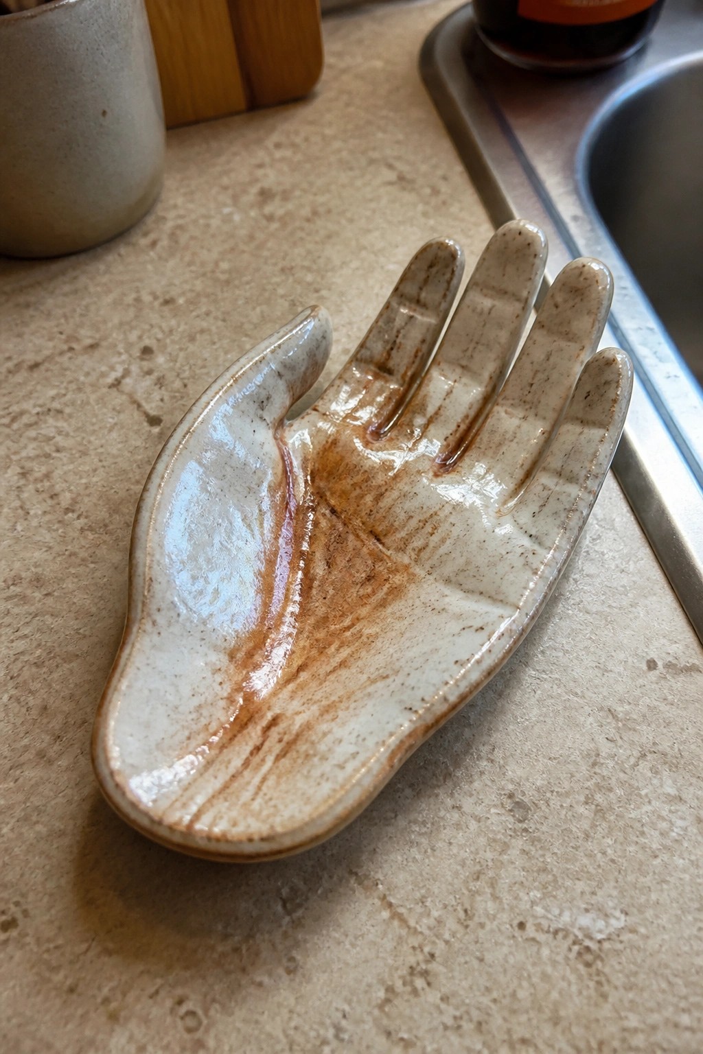
A hand-sculpted ceramic dish makes a practical spoon rest or small kitchen tray. The open palm creates a stable surface while the raised fingers keep utensils from sliding off. A white glaze base with brown accents that follow the sculpted lines adds contrast and makes the form easy to read.
This shape sits flat on a counter without taking much space and works for holding tasting spoons or small tools during cooking. You could shorten the fingers slightly to turn the same idea into a ring dish or stretch the palm wider for a soap holder in the bathroom. The glaze combination stays simple to test on other forms since the brown flows mainly into the recessed areas of the clay.
Pink Scalloped Ring Dish
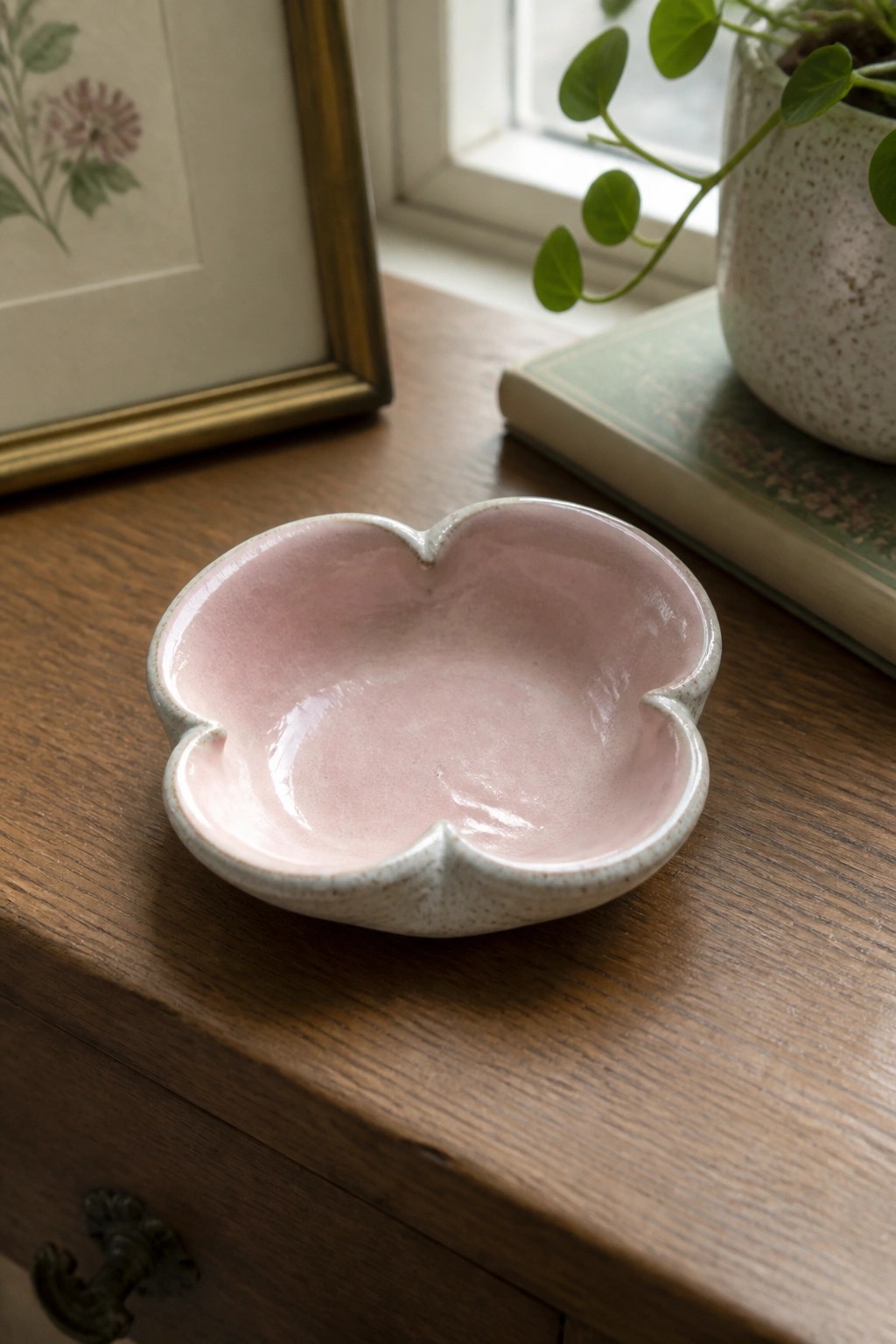
A small lobed dish like this makes a simple ring dish or trinket holder. The soft pink glaze fills the inside while the speckled clay body shows along the rim and base. The four-lobe edge creates a gentle outline that keeps the piece compact yet distinct from plain round forms.
What makes this idea useful is how the shape works for small storage on a nightstand or vanity without taking much space. You can repeat the same lobed form with other glaze colors to test combinations quickly since the piece stays small and uses little clay. The contrast between the glossy pink interior and the matte exterior also helps new glazes show up clearly in photos for studio records.
Turquoise Gradient Glaze on a Compact Planter
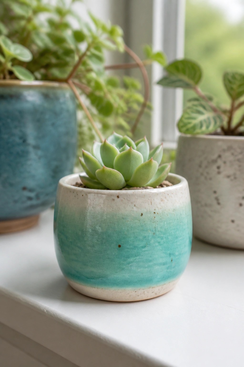
A small rounded planter uses a turquoise glaze that shifts from deeper blue-green at the base to a pale wash near the rim. The simple cylinder shape with a slightly wider opening works well for succulents or small rooted plants. The color change comes from controlled glaze application rather than added texture or carving, so the surface stays smooth and the form stays easy to throw or hand-build.
What makes this idea useful is how the same glaze layering works on any basic pot shape without needing extra tools. You can scale the gradient down to even smaller test tiles or apply it across a set of matching planters for a windowsill group. The compact size also makes it simple to try the same color shift with different base glazes like soft greens or muted blues before committing to larger pieces.
Two-Tone Glaze Candle Holder
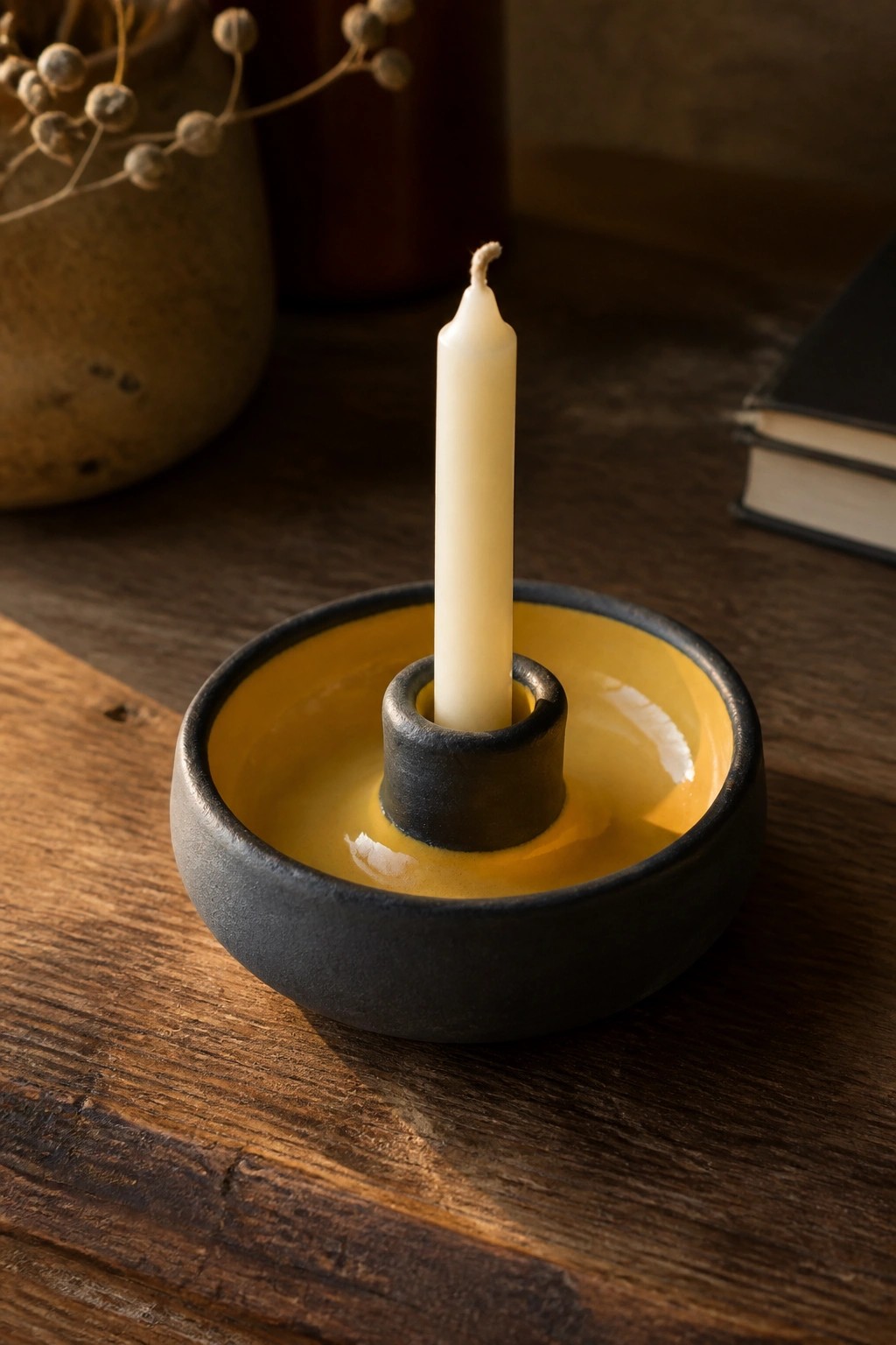
A simple candle holder takes the form of a low, wide dish with a raised central post that keeps the candle upright. The exterior uses a dark matte glaze while the interior and post receive a bright yellow glaze that pools slightly in the base. This combination highlights the contrast between the two surfaces and keeps the shape functional without added details.
What makes this idea useful is how the color split draws attention to the form while staying easy to repeat. The small scale works well on a desk, mantel, or dining table and can be adapted by switching the yellow to another mid-tone glaze for different rooms. For a gift, the same shape can be made slightly shallower or paired with a shorter candle to change the look without redesigning the piece.
Seated Cat Figurine with Patchy Rust Glaze
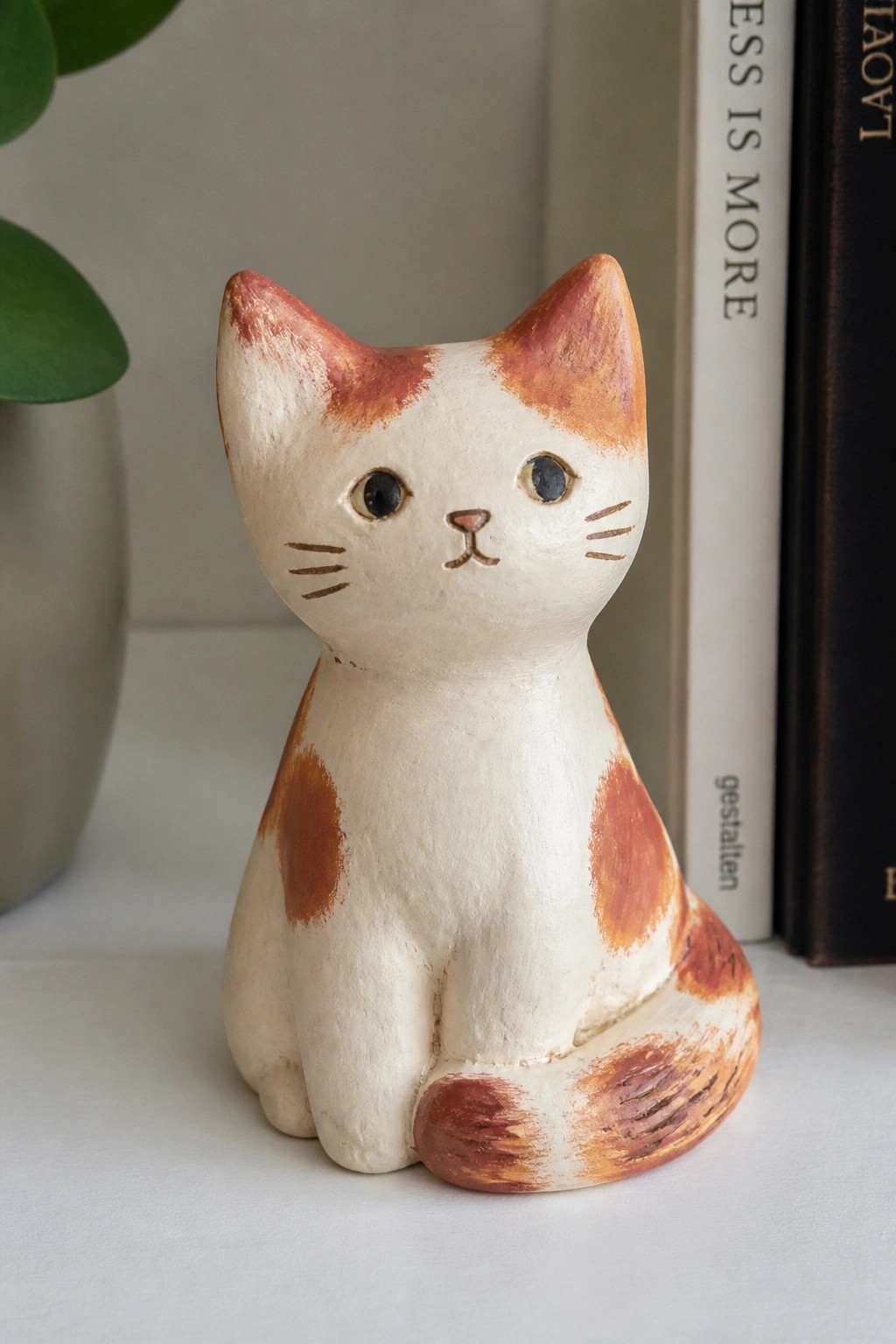
A small seated cat figurine takes shape from a simple sculpted form covered in a white base glaze. Irregular rust-colored patches are applied across the head, body, and tail to create a spotted pattern. Painted details for the eyes, nose, and whiskers finish the face with minimal lines that keep the focus on the overall shape.
What makes this idea useful is how the patchy glaze application can be repeated on other small animal forms without needing precise control. The compact size works well as a shelf accent or desk piece and can be grouped with similar figurines for a collection. You could simplify the painted face further or swap the spots for stripes if you want to adapt it into a different animal. For a gift, this kind of figurine stays practical because it needs little space and requires only basic glazing and painting steps.
Speckled Green Glaze on a Small Lidded Jar
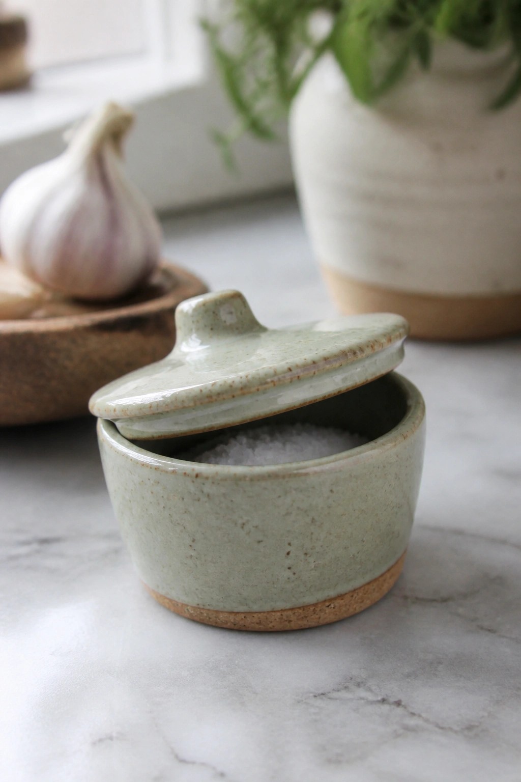
A small lidded jar makes an effective salt cellar when the upper body receives a light green speckled glaze while the foot stays unglazed. The simple rounded shape and knobbed lid keep attention on the glaze surface rather than added details. The contrast between the green and the natural clay tone gives the piece a clear visual break that works well for kitchen storage.
What makes this idea useful is how quickly you can test a glaze combo on a compact form that still has a real function. Swap the green for other colors while keeping the unglazed foot to maintain the same contrast. The size also lets you make several versions in one session for side-by-side glaze comparisons. In a kitchen, this shape fits easily on a counter or shelf without taking up much space.
Mottled Neutral Glaze on a Yarn Bowl
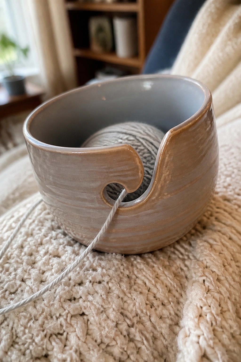
A yarn bowl is a simple, functional form that holds a ball of yarn while a notch in the rim keeps the strand from tangling as you work. This example uses a matte, streaky glaze in gray-brown tones that pools slightly along the edges and inside the notch, creating subtle variation without extra decoration. The shape stays compact with a wide opening and thick walls, making it stable on a table or lap.
What makes this idea useful is how the notch turns an ordinary bowl into a dedicated tool for knitting or crochet. The neutral glaze combination works on most clay bodies and hides minor imperfections in the form. You could repeat the same glaze on a larger version for bulkier yarns or scale it down for embroidery floss. In a studio, this shape also serves as a low-risk test piece for new glaze mixes since the curved surface shows both thin and thick application.
Coral Drip Glaze on a Three-Slot Toothbrush Holder

A simple rectangular ceramic toothbrush holder with three drilled holes takes on more visual interest when finished with a coral glaze on the lower half and a white glaze on top. During firing the white runs downward in uneven drips, creating a soft transition across the surface. The basic block shape keeps the focus on the glaze behavior rather than on added sculptural details.
What makes this idea useful is how the same two glazes can be tested on other small bathroom pieces like a soap dish or a narrow tray to build a matching set. The drip effect works on either a thrown cylinder or a slab-built form, so you can choose whichever construction method you already have tools for. Because the piece stays small it uses minimal clay and kiln space, which makes it a good test tile for new glaze combos before committing to larger work.
Turquoise Glazed Sponge Tray
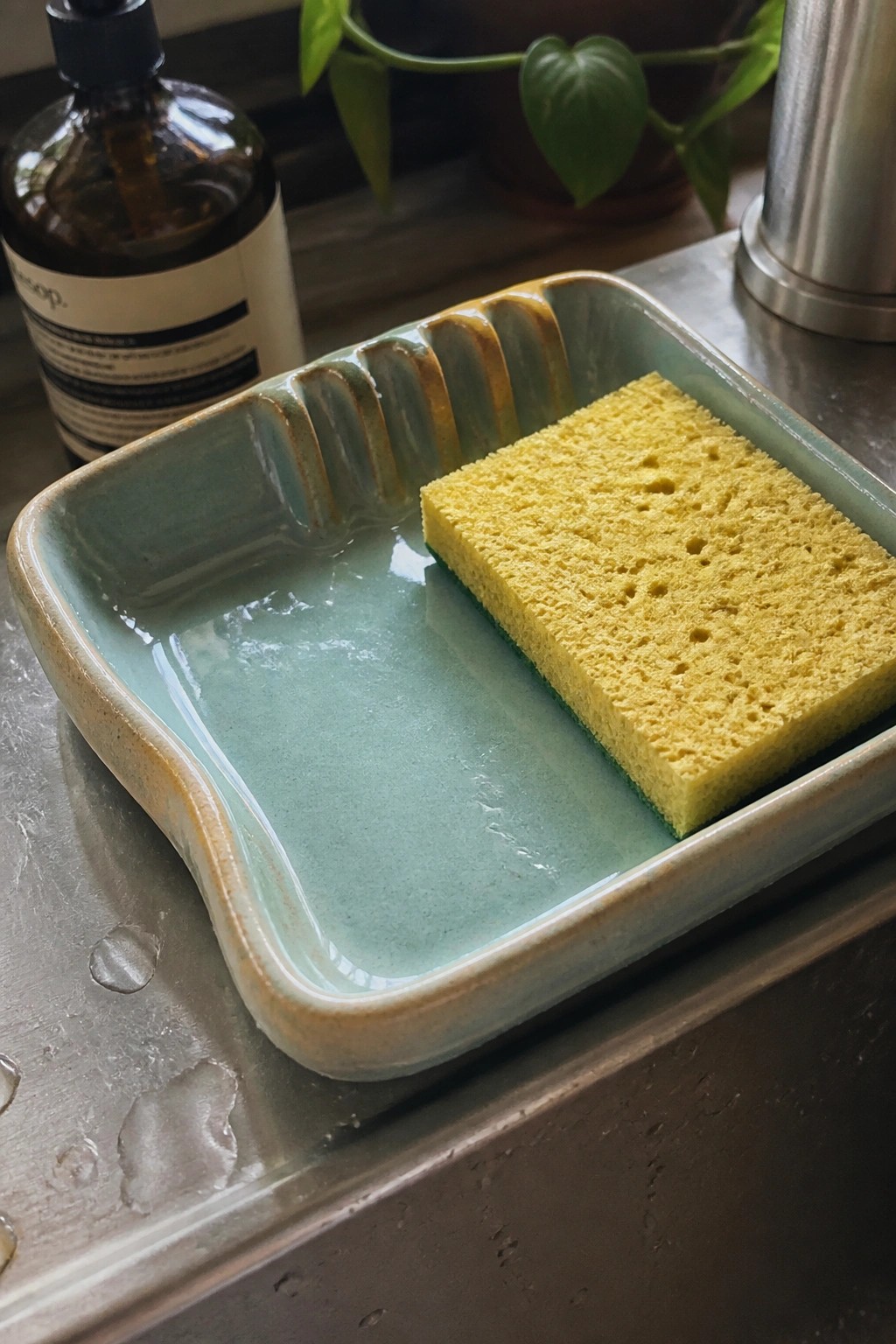
A rectangular ceramic tray with softly rounded corners and a ridged section along one edge works well as a sponge holder next to the sink. The interior is covered in a single glossy blue-green glaze that pools slightly in the center and thins to a warmer tone along the raised ridges. The tray’s low walls and flat base keep a standard sponge contained while allowing water to collect and drain away from the counter.
What makes this idea useful is the simple combination of a practical kitchen shape and an easy single-glaze application that still shows variation where the glaze thins. The ridged detail gives the piece function without extra carving, and the size fits neatly beside a faucet. You could repeat the same form in a smaller scale for a soap dish or stretch it longer for a dish-drying tray. The glaze color also photographs cleanly for sharing, which helps the project stand out when posted online.
Leaf Shaped Ring Dish with Green Glaze and Gold Rim

A leaf-shaped ring dish gives you a compact place to keep rings or small jewelry. The form includes raised veins that catch glaze and create natural contrast once fired. A muted green glaze covers the surface while a thin gold rim finishes the edge and draws attention to the irregular outline.
The small scale makes this easy to adapt into a soap rest or a desk tray for paper clips. You can repeat the same leaf press in different sizes to build a matching set or swap the green for another mid-range glaze color you already use often. The shape stands out in photos because the veins and rim give it clear definition without extra carving.
Speckled Stripe on a Light Blue Tile
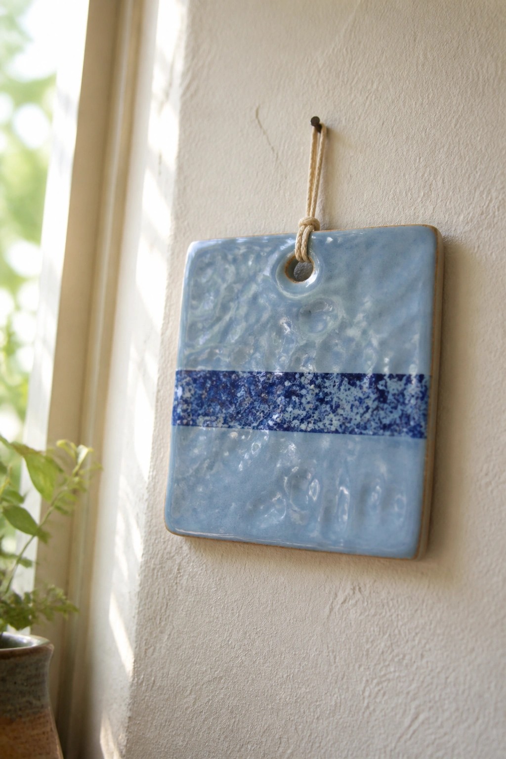
A square ceramic tile uses a light blue base glaze over the full surface with a single horizontal band of darker speckled blue running across the middle. The glaze shows a textured, cratered finish that developed during firing. A small hole near the top edge lets the tile hang from cord or wire. This layout keeps the focus on how two glazes interact on a flat plane without added carving or underglaze work.
What makes this idea useful is how the stripe creates contrast while staying easy to repeat. You can adjust the band width or swap the speckled color to test other combinations on the same tile shape. The format also works for a set of matching pieces or as a simple test tile for tracking glaze results. For wall use, the square form and limited palette keep it clean enough to group with other sizes or colors later.
Speckled Neutral Glaze with Teal Rim
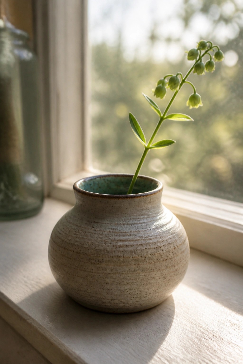
A small rounded vase made from wheel-thrown clay uses a matte speckled glaze across the exterior body and a contrasting teal glaze on the interior rim. The shape stays simple with a bulbous lower half and short neck, letting the glaze contrast and subtle surface texture do the visual work. This approach fits the category of a bud vase or small planter meant for a single stem or cutting.
The shape does a lot of the work here because the compact size fits easily on windowsills, shelves, or tabletops without taking up much space. You could adapt the same glaze pairing to a taller cylinder form or a set of small cups while keeping the neutral exterior for versatility across different rooms. For a gift, something like this stands out on Pinterest when the rim color is just bright enough to catch the eye against the speckled body.
Speckled White Exterior with Glossy Yellow Interior
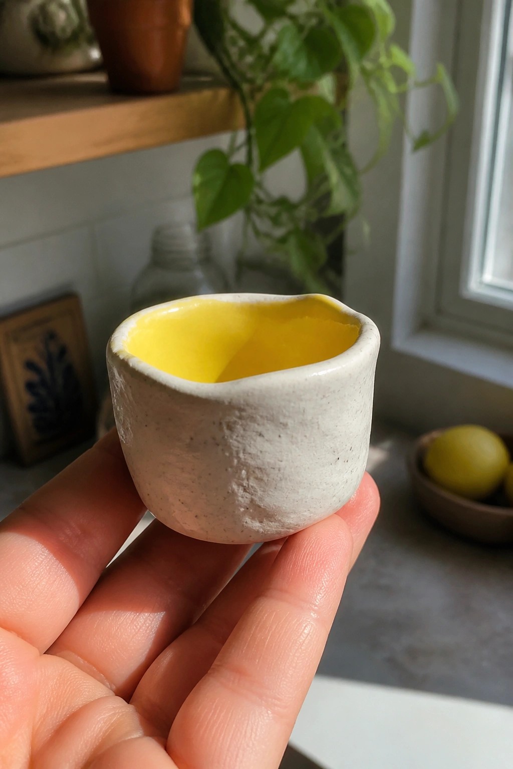
A small handmade cup or bowl works well with a matte speckled white glaze on the outside and a bright glossy yellow on the inside. The contrast keeps the piece simple while making the interior color stand out clearly against the neutral, textured surface. The irregular rim adds to the handmade look without needing extra decoration or carving.
What makes this idea useful is how the small size lets you test glaze combos quickly without using much material. The same pairing could adapt to espresso cups, small sauce dishes, or pinch pots for desk use. In a kitchen or on open shelving, the yellow interior catches light and draws attention even when the piece sits among other items. You could swap the yellow for another bold color or keep the speckled white and change only the interior to build a matching set.
Blue Rim Cream Pitcher
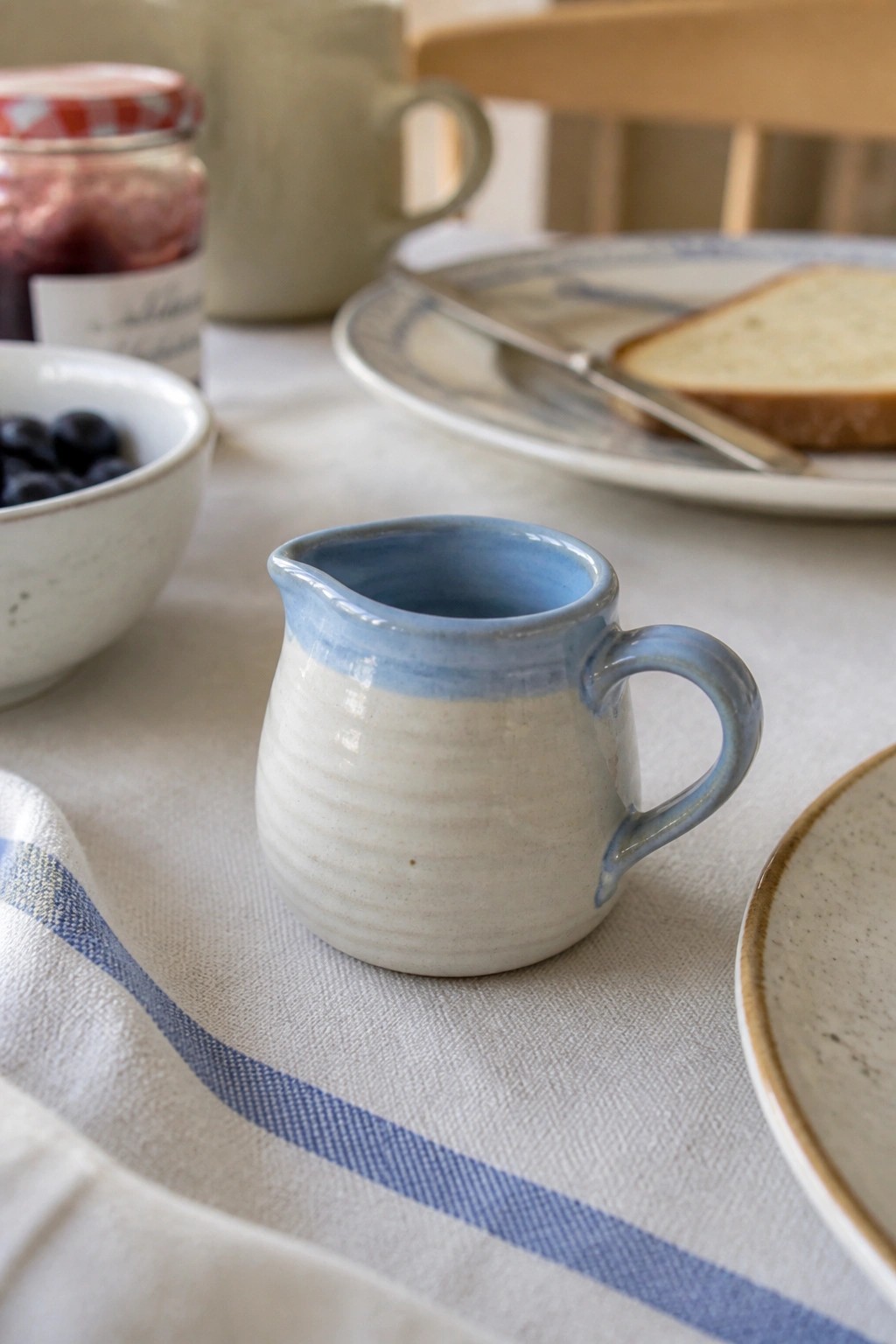
A small cream pitcher makes a practical kitchen item when the base stays a simple white glaze and the rim plus handle get a band of blue. The shape stays compact with a short spout and a looped handle that keeps the piece easy to grip and pour from. The blue accent sits only on the upper edge and the handle curve, which keeps the rest of the form clean while still giving the eye a clear focal point.
What makes this idea useful is that the small scale works on a breakfast table or next to a coffee maker without taking much space. You can repeat the same rim-and-handle treatment on a matching sugar bowl or a set of small cups to build a quick collection. In a kitchen the blue edge helps the pitcher stand out against plain dishes or a white tablecloth. For another version, swap the blue for a different color or move the accent to the foot instead of the rim.
Speckled Brown Glaze on a Small Kitchen Bowl
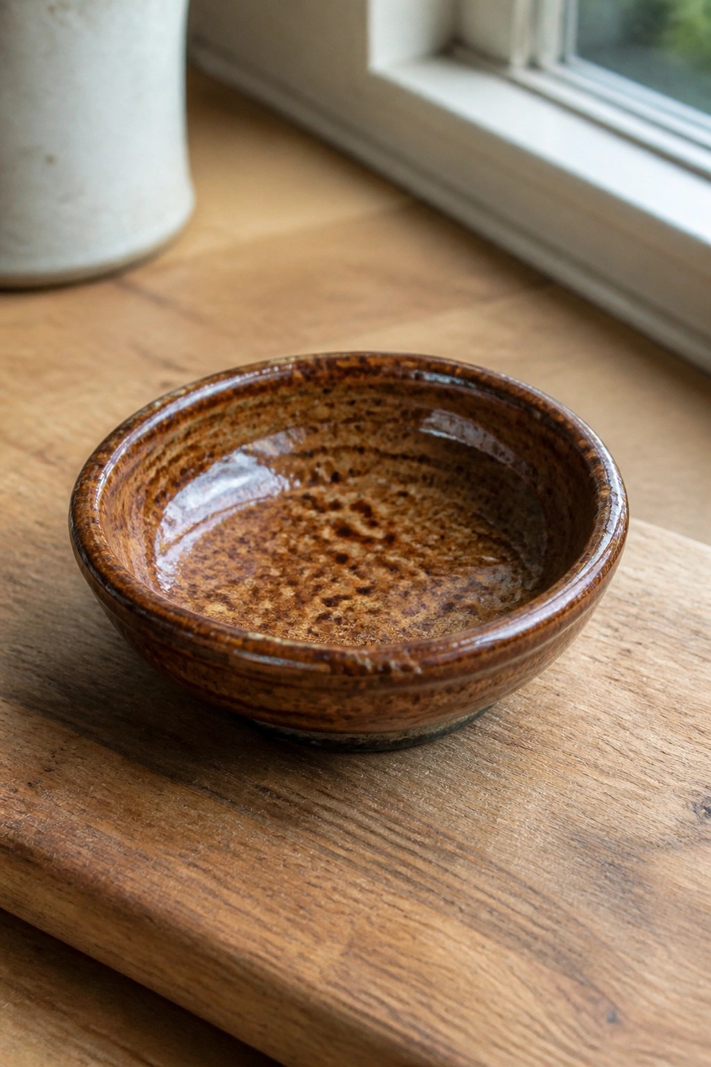
A compact round bowl finished with a glossy brown glaze that breaks into lighter patches and dark speckles across the interior and rim. The glaze pools slightly at the base and thins toward the edges, creating natural variation without added decoration. This style works well for simple wheel-thrown or slab-built bowls intended for dipping sauces, snacks, or small prep tasks.
What makes this idea useful is how the single glaze handles most of the visual work on a basic form that stacks easily and takes up little shelf space. You could scale the same glaze and shape up for a slightly larger cereal bowl or switch the form to a small tray for jewelry or keys. In a kitchen this piece stays practical for daily use while the mottled finish keeps it from looking plain next to other dishes.
Two Tone Bowl Tealight Holder
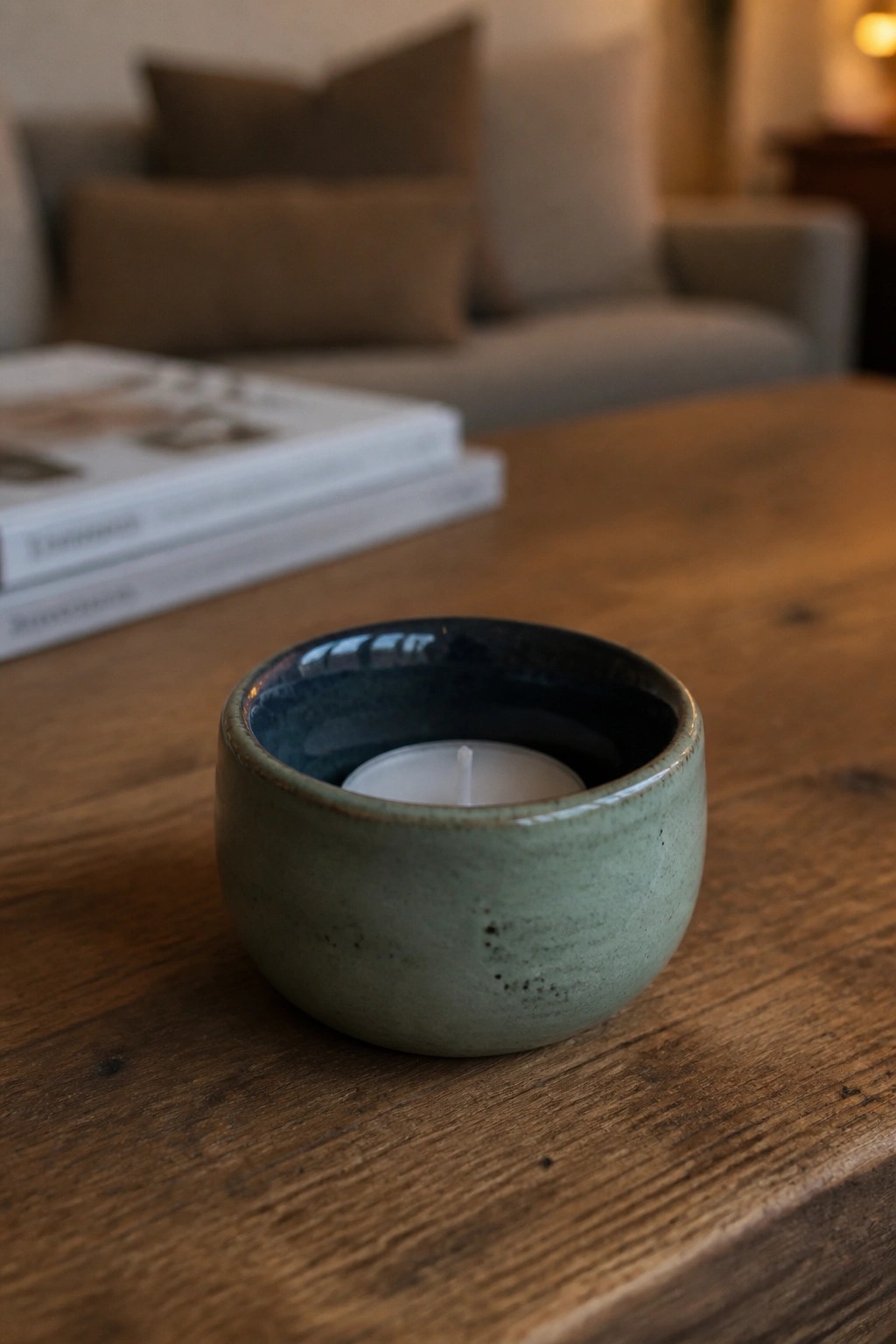
A small handmade ceramic bowl works well as a tealight holder when the interior gets a darker glaze than the outside. The green exterior stays matte and speckled while the blue inside turns glossy, which creates a simple contrast that still shows the form clearly. This shape stays low and rounded so the flame sits safely below the rim without extra carving or handles. What makes this idea useful is how quickly it adapts to different glaze pairs. Try the same bowl form with any two glazes that contrast in value, then keep the size small so it fits on side tables or shelves without taking up space. The basic round shape also translates easily into a tiny planter or ring dish if you skip the candle. For studio testing, this setup lets you see how two glazes interact on both vertical and horizontal surfaces in one quick piece.
Frequently Asked Questions
What are the best ways to test these glaze combinations before committing to larger pieces?
Start with small test tiles made from the same clay body you plan to use. Apply the glazes using the exact layering order and number of coats described for each combination, then fire them alongside your regular work to capture real kiln conditions. Label each tile clearly with the combination details and firing cone so you can compare results accurately over time.
How can I achieve more consistent outcomes when repeating these combinations in different kiln loads?
Maintain a firing log that tracks glaze batch numbers, specific gravity measurements, application thickness, and exact firing schedules. Mix fresh batches to the same consistency each time and avoid introducing variables like new clay sources or kiln loading patterns. This systematic approach helps isolate what works and allows reliable replication of successful results.
Are these combinations compatible with different clay bodies such as earthenware or porcelain?
Many of the listed pairings perform well on mid-range stoneware and porcelain, but earthenware typically requires adjustments to lower cone firings. Always run tests on your specific clay to check for issues like crazing or shivering, and consider using a compatible slip or adjusting the base glaze if needed for better adhesion and predictability.
What steps should I take if one of the combinations produces unexpected colors or textures?
Review your application notes first to confirm coat thickness and drying times matched the recommendations. Next, test small adjustments such as reducing the top layer or changing the firing ramp speed while keeping other elements constant. Document each variation on new tiles to build a personal reference guide tailored to your studio setup.
How should I store and maintain the glazes used in these combinations for repeated studio sessions?
Keep each glaze in airtight containers at room temperature and stir thoroughly before every use to redistribute settled materials. Check the specific gravity periodically and add water or dry ingredients as needed to maintain the original consistency. Re-test small samples every few months to verify performance remains stable before applying to finished work.

Pottery Path is my cozy corner of the internet where I share clay ideas, pottery inspiration, and simple projects you can recreate at home. I love exploring everything from air dry clay to handbuilt pottery to cute minis that brighten your day. My goal is to make clay crafting feel easy, fun, and welcoming for anyone who wants to try it.
You will find beginner friendly tutorials, creative pottery painting ideas, and lots of warm inspiration for slow and happy crafting. If you enjoy hands on creativity, this space will feel like home.